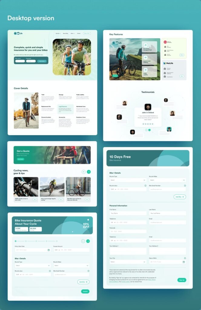
Velolife Website
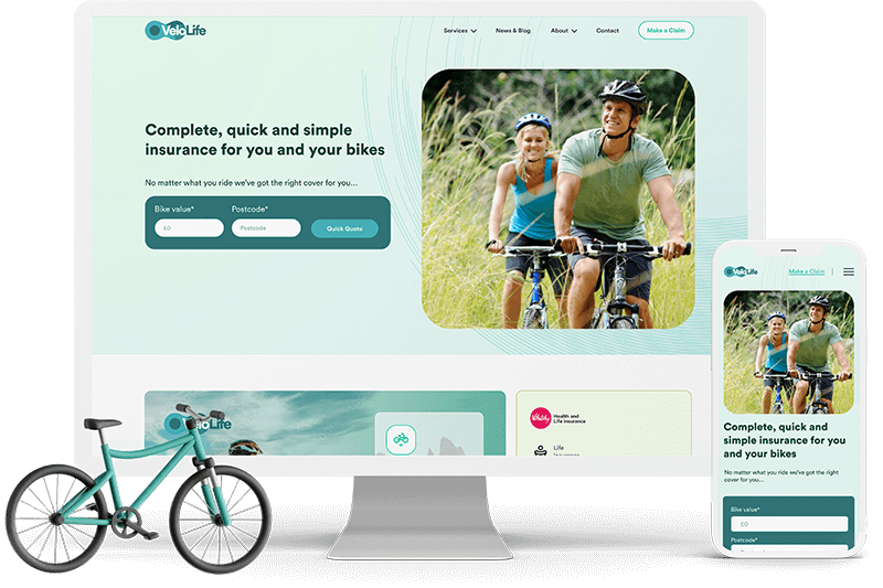
Project overview
VeloLife is a supplier of bike insurance and related services. They experienced a drop in sales and leads and decided to create a new, user-centric experience for website visitors, with a primary focus on bike insurance and additional services for life and health insurance.
This project’s goal was to fix major flaws with their outdated landing page design and create a new user experience that would effectively attract and engage their target audience.
Role: UX Researcher, UX/UI designer, & Developer
Toolkit: Figma, Adobe CC, FigJam, HTML,CSS, React
Problem
The website’s outdated design and lack of modern functionality did not align with the company’s professional image or meet the expectations of contemporary users. This presented an opportunity to create a more sophisticated and user-centric platform that reflected the company’s expertise and instilled trust in its audience.
Solution
EFX addressed the challenges by creating a modern, dynamic website with a redesigned landing page to enhance user engagement, boost sign-ups, and improve the overall user experience. The design featured interactive 3D elements and animations, offering a unique and innovative approach that set EFX apart from competitors.
Information Architecture
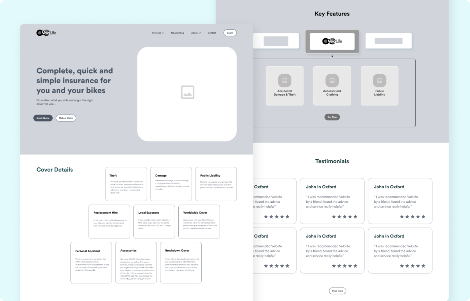
For the information architecture, I structured the single-page layout with clear, intuitive sections: homepage header, “About Us,” “Our Services,” “Industries,” “Features,” “Partners,” and “Contact Us.” This design allows users to easily navigate and access key information, ensuring a seamless and engaging experience.

Previous Design

Wireframe
Low-Fidelity
High-Fidelity Designs

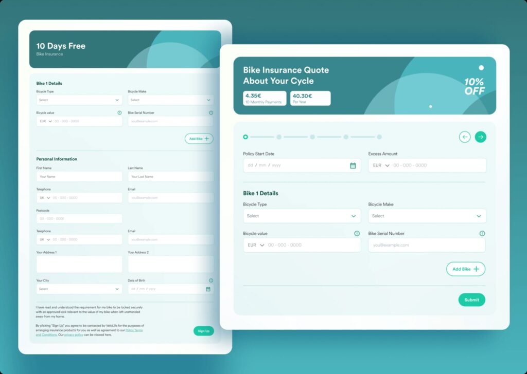
Design System

Design Iteration
Once the initial design was presented to the client, it was crucial to gather feedback and insights. The collaborative process is integral to crafting a user experience that aligns perfectly with the client’s vision and the end-users’ needs. The following insights were gathered:
1. Make a Claim” to navbar and added Quick Quote to decrease the interaction cost

2. Restructured the layout to balance content and visual elements while aligning columns using a grid system

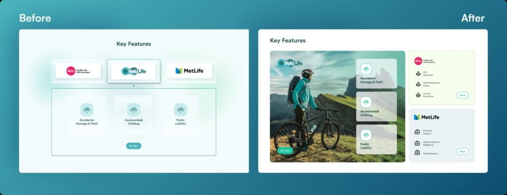
3. Adjusted the layout to emphasize the primary service, enabling users to distinguish main services from additional offerings.
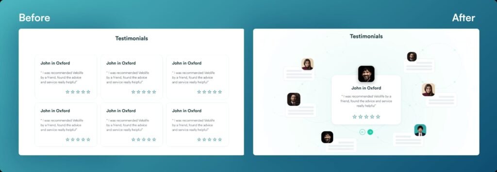
4. Refined the visual presentation of the testimonials section to enhance visibility and user interaction.
Final Layout
Our solutions have transformed VeloLife’s website into a user-centric platform. Users now navigate the site effortlessly, understanding their insurance options, and completing quote requests. Conversion rates have soared, and visual consistency has enhanced brand alignment.
The website is now an engaging and trustworthy gateway for bike insurance, boosting VeloLife’s success in the industry. In this journey, we demonstrated the power of user-centric design in enhancing website performance, maximizing user engagement, and increasing conversion rates. With these improvements, VeloLife is poised for further growth in the highly competitive insurance
